Skip to content
Research / Education / Candlesticks

TA · Foundations · Part 2 of 20

How to read a price chart: candlesticks explained simply

Line, bar and candlestick charts show the same data three ways. This guide explains what each one records, what a candle's body and wick mean, and why candlesticks became the standard.

InnoMP Research Published 30 Aug 2026 · Updated 01 Sept 2026 7 min read
In short

A price chart plots price against time. A line chart connects closing prices only. A bar or candlestick chart shows four values for each period: the open, high, low and close. A candlestick fills the space between open and close as a body and draws thin wicks to the high and low, which makes the direction and strength of each period readable at a glance.

A price chart plots price against time. Every chart type shows the same underlying transactions — they differ only in how much of each period they keep.

Understanding what each one throws away is the difference between reading a chart and just looking at one.

Step 1: a chart is made of time slices

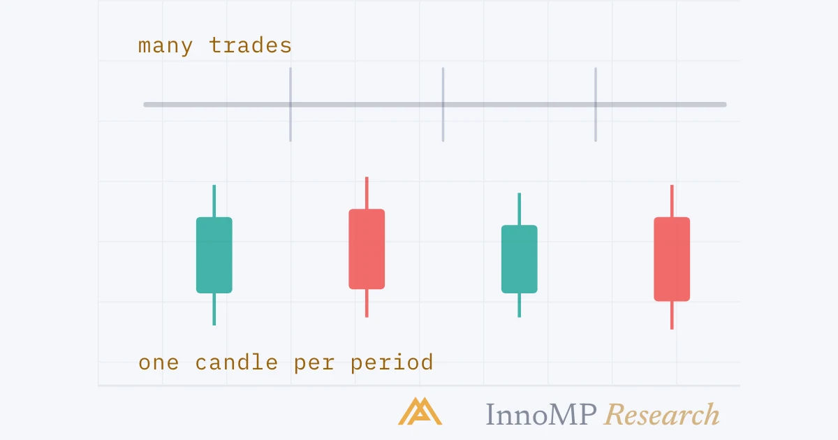
A chart does not show every individual trade. It groups them into equal slices of time, and draws one shape per slice.

On a 1-hour chart, each shape covers one hour of trading. On a daily chart, each shape covers a day. Choosing that slice size is Part 3; for now, just know that each shape on a chart is a summary of one time period.

Trades grouped into equal time slices, one shape per slice A row of many small dots representing individual trades along a timeline, with vertical dividers grouping them into four equal periods. Below, four shapes are drawn, one under each group, showing how each period becomes a single shape on the chart. Individual tradesOne shape per period1 hour · 1 hour · 1 hour · 1 hour InnoMP Research
Many individual trades go in; one shape per time period comes out. That grouping is what makes a chart readable.

Step 2: the four numbers in every period

Split any period and four prices define it. Remember these four and the rest of this course follows.

ValueWhat it records
OpenFirst traded price of the period
HighHighest price reached
LowLowest price reached
CloseLast traded price of the period

These four together are called OHLC.

The close matters most. It is the price participants were willing to end the period on — the settled opinion, rather than the argument that happened along the way.

The four values that define one period on a chart A single large candlestick with four horizontal dashed guide lines labelled high, open, close and low. The body of the candle spans open to close and the thin wick extends up to the high and down to the low. HIGHOPENCLOSELOWBODYWICKthis candle fell: close is below open InnoMP Research
One period, four numbers. The body is open-to-close; the wicks reach the high and the low.

Step 3: the three chart types

Line chart — connects one point per period, the close, and drops the rest. Simple and quiet. Useful when a chart looks messy and you want to see the shape of the move.

Bar chart (OHLC) — a vertical line from low to high, with a small tick on the left for the open and on the right for the close. All four values, plainly drawn.

Candlestick chart — the same four values, but the space between open and close is filled in as a body, with wicks reaching to the high and low.

The same period shown as a line point, an OHLC bar and a candlestick Three renderings of one identical price period side by side. The line version shows a single dot at the close. The bar version shows a vertical line with left and right ticks. The candlestick version shows a filled body with wicks. Dashed guide lines connect the same four price levels across all three. LINEBARCANDLEclose onlyall four valuesall four, at a glance InnoMP Research
Identical data, three drawings. The line keeps only the close; the bar and candle keep all four — the candle is simply faster to read.

Step 4: reading a candle’s shape

This is the skill that carries through the whole course. Two things to look at, in this order.

How long is the body? The body is the settled part — where the period began and ended. A long body means one side pushed price and held the gain into the close. A small body means the period finished close to where it started.

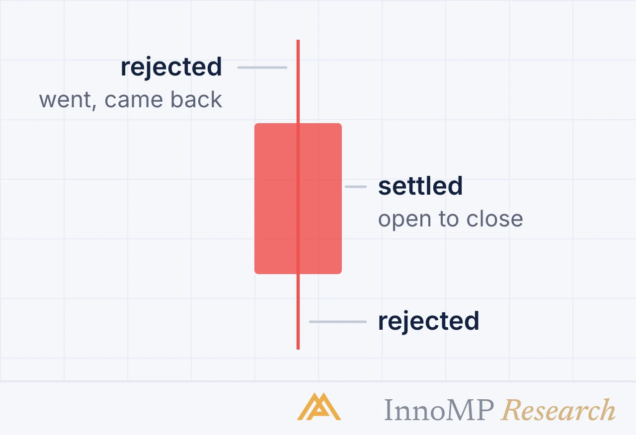
How long are the wicks? Wicks are the rejected part — prices reached and not held. A long lower wick means sellers pushed price down and buyers pushed it back before the close.

Four candle shapes and what each proportion means Four candlesticks arranged in a two by two grid. Top left has a long body and no wicks, labelled strong, one side controlled. Top right has a small body at the top with a long lower wick, labelled long tail, pushed down then rejected. Bottom left has a small body at the bottom with a long upper wick, labelled long top, pushed up then rejected. Bottom right has almost no body with wicks both sides, labelled doji, closed where it opened. Strongone side controlledthe whole periodLong tailpushed down,buyers pushed backLong toppushed up,sellers pushed backDojiclosed whereit opened InnoMP Research
Body length shows conviction. Wick length shows where an attempt was rejected. Read those two before learning any pattern name.

Key takeaway Body = what was settled. Wick = what was rejected. Those two words let you describe any candle on any chart, without memorising a single pattern name.

Reading one candle in three steps A single candlestick with three numbered annotations pointing at it. Step one points at the body and asks how long it is. Step two points at the wicks and asks how long they are. Step three points at the body position and asks which side finished in control. 1How long is the body?long = one side controlled2How long are the wicks?long = an attempt was rejected3Which side won?close above open= buyers finished ahead InnoMP Research
Three questions, in this order. Answer them on any candle and you have described it — no pattern names required.
What a line chart hides compared with a candlestick chart Two panels of the same six periods. The upper panel is a smooth line connecting six closing prices. The lower panel shows the same six periods as candlesticks, revealing long wicks and one large reversal that the line chart smoothed away. Line — closes onlyCandles — the same periodslong wicks the line never showed InnoMP Research
Same closes, same shape. The candles show two rejections and a large reversal that the line simply did not record.

A note on colours

One colour marks periods that closed above their open, another marks periods that closed below. Green and red are the common pairing, but this is a platform setting, not a standard.

Check which way yours is configured before relying on it — and note that on a black-and-white printout, colour disappears while body and wick proportions remain readable. That is another reason to learn shape before colour.

Which to use, and when

  • Candlesticks for almost everything — entries, structure, patterns
  • Line when a chart looks noisy and you want the underlying shape
  • Bar if you find candle colours visually loud on longer timeframes

On InnoMP, WebTrader offers 4+ chart types across 8 timeframes with 30 drawing tools, and MetaTrader 5 adds 46 graphical objects. Far more than anyone needs — the tool matters far less than reading the same instrument the same way every time, so what changes on screen is the market and not your settings.

Next: Choosing a timeframe — how much time each candle should cover, and what each choice hides.

Key facts
  • Every period on a chart has four values: open, high, low and close.
  • A candle's body spans the open and close; its wicks span the high and low.
  • A long body means one side controlled the period; a small body means neither did.
  • Candle colours are a platform setting, not a standard — check which way yours is set.
Frequently asked questions

What do the four values on a candlestick mean?

The open is the first traded price of the period, the high and low are the extremes reached, and the close is the last traded price. Together they summarise everything that happened in that slice of time.

What does the body of a candle tell you?

It shows where the period started and finished. A long body means price moved decisively in one direction and held it into the close. A short body means the period ended near where it began, whatever happened in between.

What is a wick on a candlestick?

The thin line above or below the body, marking the highest and lowest prices traded. A long wick means price reached that level and was pushed back before the close — an attempt that failed.

What do the colours on a candlestick chart mean?

One colour marks periods that closed above their open and another marks periods that closed below. Green and red are conventional, but the colours are a platform setting rather than a rule, so check yours before relying on them.

Which chart type should a beginner use?

Candlesticks. Direction is visible without decoding anything. Switch to a line chart occasionally when a chart looks noisy and you want to see the underlying shape of the move without wicks distracting you.

InnoMP Research

Market research, trading education and platform guides from the InnoMP research desk — covering forex, metals, indices and stock CFDs.

Published 30 Aug 2026 · Updated 01 Sept 2026 · Reviewed by InnoMP Compliance

Disclaimer: This content is provided for general informational purposes only and does not constitute investment advice, an offer, or a solicitation to buy or sell any financial instrument. It has been prepared without regard to your individual financial circumstances or objectives. Trading CFDs involves a high risk of loss.

Related notes

Support & resistance

Support and resistance explained for beginners

The most useful lines on any chart, and the most commonly drawn wrong. What these levels actually are, how to draw them as zones, and why a broken support becomes resistance.

8 min read