Skip to content
Research / Education / Market structure

TA · Foundations · Part 3 of 20

Trading timeframes explained: which chart should you use?

The 5-minute and the daily chart show the same market and can look completely different. This guide explains what a timeframe is, how to pick one, and why traders use two together.

InnoMP Research Published 30 Aug 2026 · Updated 01 Sept 2026 7 min read
In short

A timeframe is how much market time each candle on a chart represents — one minute, one hour, one day. Longer timeframes show the bigger trend and give fewer, more reliable signals. Shorter ones show detail and give more signals with more noise. Most traders use two: a higher one to decide direction and a lower one to time the entry.

A timeframe is how much market time each candle represents. On a 1-hour chart, one candle summarises an hour. On a daily chart, one candle summarises a day.

Choosing a timeframe is choosing how much detail to keep — and, unavoidably, what to stop seeing.

The same market, three timeframes

Start with the key idea. One market, viewed three ways, can produce three different impressions.

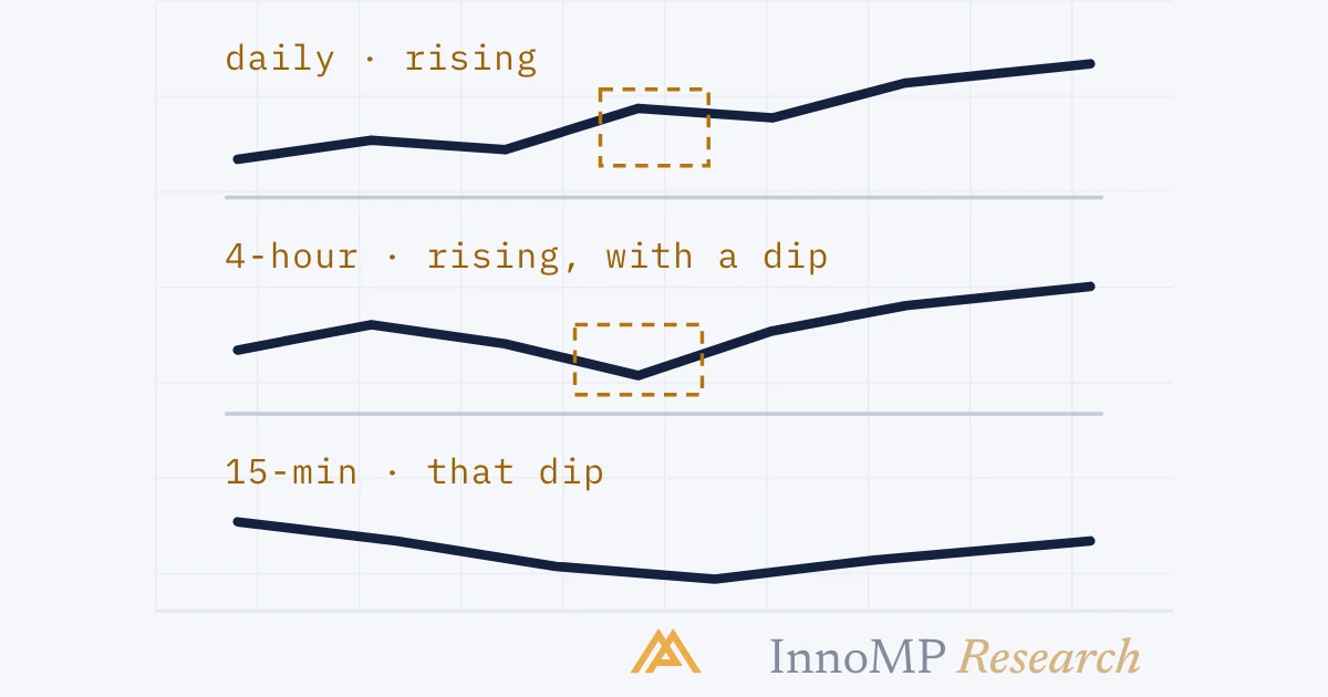
The same market shown on a daily, 4-hour and 15-minute chart Three stacked mini charts of the same market. The top daily chart shows a smooth uptrend. The middle four-hour chart shows the same rise with a visible dip. The bottom fifteen-minute chart zooms into that dip and shows it as a clear downtrend. Daily — rising4-hour — rising, with a dip15-min — that dip, fallinga downtrend inside an uptrend InnoMP Research
One market, three zoom levels. The bottom chart is not disagreeing with the top — it is showing the inside of one small part of it.

The trade-off

Every timeframe sits somewhere on one scale.

TimeframeSignalsNoiseTime it demands
1–5 minManyHighConstant attention
15 min – 1 hrModerateModerateA few checks a day
4 hr – dailyFewLowOnce or twice a day
WeeklyRareVery lowWeekly

Two things move together going down that table: signals get rarer, and each one means more. That is not a flaw to optimise away — it is the shape of the problem.

Why higher timeframes carry more weight

This is the single most useful principle here.

A price level on the daily chart was formed by everyone who traded that day. The same level on a 5-minute chart was formed by whoever happened to be active in those five minutes.

A level’s importance grows with the number of participants who helped create it. So a daily support level tends to hold better than a 5-minute one — more money agreed on it.

How many participants form one candle on different timeframes Two panels. The left shows one 5-minute candle with a small group of participant icons beneath it. The right shows one daily candle with a much larger group of icons beneath it, illustrating that more participants form each higher-timeframe candle. One 5-min candlea few participantsOne daily candlefar more participants InnoMP Research
Same shape, very different weight behind it. This is why a daily level outranks a 5-minute one.

The mistake beginners make

Traders often say a chart is “giving mixed signals” when what is really happening is that they asked two timeframes the same question and expected one answer.

A rising daily chart and a falling 15-minute chart are not in conflict. The 15-minute downtrend is the pullback inside the daily uptrend.

A falling 15-minute chart inside a rising daily chart A large rising price line labelled daily uptrend. One of its dips is circled and expanded into an inset panel showing a clear downtrend on the 15-minute chart, labelled the same move seen closer. Daily · rising15-minute · falling InnoMP Research
Not a contradiction. The lower timeframe is showing the inside of a pullback that the higher timeframe treats as one dip.

Reading them as contradictory produces the classic error: abandoning a correct bigger-picture view because a smaller one temporarily disagreed.

Give each timeframe a job

The fix is to stop asking them the same question.

Assigning a different job to each timeframe Three stacked rows. The top row labelled higher timeframe is assigned direction. The middle row labelled trading timeframe is assigned the setup. The bottom row labelled lower timeframe is assigned entry timing only, with a note that it never overrules direction. Higher — e.g. dailyWhich way is the trend?Trading — e.g. 4-hourWhere is the setup?Lower — e.g. 1-hourWhen exactly to enterthe lower chart never overrules direction InnoMP Research
Direction comes from above and never gets overruled from below. The lower chart's only job is timing an entry in the direction already decided.

A common pairing is 4-hour for direction, 1-hour for setups, or daily and 4-hour for slower trading. The exact numbers matter less than the gap between them — roughly 4 to 6 times apart is enough separation to be useful.

Key takeaway Never let a lower timeframe overrule a higher one on direction. The lower chart exists to time an entry in the direction the higher chart already established — not to argue with it.

The cost argument for beginners

Here is a practical reason to start higher that most guides skip.

Every trade pays the spread when you open it, and that cost is the same whether you are aiming for 8 pips or 80.

  • On a 5-minute chart targeting 8 pips, a 0.6-pip spread is 7.5% of your target
  • On a 4-hour chart targeting 80 pips, the same spread is 0.75%

Same strategy, and the cost drag fell by a factor of ten. This is why very short timeframes need tighter spreads and higher accuracy just to break even — and why traders struggling with costs often improve simply by moving up a timeframe.

Trading cost as a share of the target on two timeframes Two horizontal bars. The upper bar represents an eight pip target on a five minute chart with a small red segment showing the spread taking seven and a half percent of it. The lower bar represents an eighty pip target on a four hour chart with a barely visible red segment showing zero point seven five percent. 5-min chart · 8 pip targetspread = 7.5% of target4-hour chart · 80 pip targetspread = 0.75% of targetSame strategy. Ten times less cost dragsimply by moving up a timeframe. InnoMP Research
The same spread, two targets. On the short timeframe the cost eats a tenth of the move before you are right about anything.

How to choose yours

Answer one question honestly: how often can you actually look at a chart?

Someone who checks twice a day cannot run a 5-minute strategy. Attempting it produces missed exits, not profits. Match the timeframe to the schedule you really have, not the one you intend to have.

InnoMP WebTrader offers 8 timeframes and MetaTrader 5 offers 21 — far more than anyone needs. Pick two, and read the same instrument the same way every time. Consistency is what turns a chart into something you can learn from.

Next: Trend or range? — the first question every chart read should answer.

Key facts
  • A timeframe sets how much trading activity each candle summarises.
  • Higher timeframes carry more weight because more participants traded within each candle.
  • The same market can be rising on the daily chart and falling on the 15-minute chart — both readings are correct.
  • Trading costs are a much larger share of a small target than a large one, which favours higher timeframes for beginners.
Frequently asked questions

What is a timeframe in trading?

It is how much market time each candle on your chart covers. On a 1-hour chart every candle summarises an hour of trading; on a daily chart every candle summarises a day.

What is the best timeframe for beginners?

The 1-hour and 4-hour charts. They move slowly enough to allow thinking time, produce a manageable number of setups, and are far less affected by trading costs than the 1- or 5-minute charts.

Why does the same chart look bullish on one timeframe and bearish on another?

Because each timeframe summarises a different span of activity. A rising daily chart is fully compatible with a falling 15-minute chart during a pullback. Neither is wrong — they answer different questions.

How many timeframes should I use?

Two or three. One higher timeframe for direction and one lower for timing your entry. Beyond three, most traders end up finding whichever chart agrees with what they already wanted to do.

Why do lower timeframes have more noise?

On a 1-minute chart a single large order can create a candle that looks significant. On a daily chart the same order is invisible. Lower timeframes contain more movement that carries no lasting meaning.

InnoMP Research

Market research, trading education and platform guides from the InnoMP research desk — covering forex, metals, indices and stock CFDs.

Published 30 Aug 2026 · Updated 01 Sept 2026 · Reviewed by InnoMP Compliance

Disclaimer: This content is provided for general informational purposes only and does not constitute investment advice, an offer, or a solicitation to buy or sell any financial instrument. It has been prepared without regard to your individual financial circumstances or objectives. Trading CFDs involves a high risk of loss.

Related notes

Support & resistance

Support and resistance explained for beginners

The most useful lines on any chart, and the most commonly drawn wrong. What these levels actually are, how to draw them as zones, and why a broken support becomes resistance.

8 min read